Understanding the Basics
In the ever-changing landscape of design trends. Few have gone through the ups and downs of skeuomorphism.
A past trend in design thinking, skeuomorphism was once favoured, then rejected. It is now finding its way back in a new way. Establishing digital design in the sense of connections, depth, and nuance that pulls users back into touch.
In this revolution, skeuomorphic design is being beckoned back. Processed and revived with emotional and practical intelligence.
What Is Skeuomorphism?
In short, skeuomorphism is the concept of designing. A digital interface that imitates real-world objects. It is based on real familiarity to assist a user in navigating systems that are unfamiliar.
For example, the floppy disc icon for “save” and a folder that looks like a classic file folder. There are faint hints that provide users with a part of their knowledge that they can mentally tap into.
Skeuomorphism involves designing digital interfaces that imitate physical elements. Easing the learning curve for unfamiliar experiences. While it was originally popular, Skeuomorphism offered some level of intuitiveness. Entry into digital spaces during the rise of early touch-based systems and graphical interfaces.
Criticism soon followed. It didn’t take long for critics to emerge, proclaiming that the use of heavy realism in interfaces. It would obscure content, distract from user experiences, and hinder creative exploration.
With Apple’s iOS 7 and its drastic switch to a flat design aesthetic in 2013. The industry swiftly moved away from heavy textures to cleaner, minimal forms and aesthetics.
The concept relies on users’ mental models. Their internal understanding of how things work. Making it easier to navigate unfamiliar systems.”
During digital design, skeuomorphism was invaluable. Because it bridged the gap between the physical and digital worlds. At a time when most people were new to computers and smartphones.
Why Did Skeuomorphism Fade? And why is it back?
During the early 2010s, skeuomorphism dominated interface design. Apple’s iOS employed patterned stitched leather textures and realistic shadows. On their skeuomorphic bookshelves.
These elements provided emotional imagery. But they were also increasingly viewed as visually heavy and, ultimately, irrelevant. By users as they became increasingly digitally literate.
The pendulum swings in the direction of flat design. A minimalist movement that got rid of depth, texture, or decoration. In favour of clean lines with some solid colour.
It boasted faster download speeds, improved scalability on devices, and a fresh look. When Apple finally switched to flat design with iOS 7. Many other organisations swiftly made the switch as well.
However, as flat design continued to grow and mature, it had a major drawback. By not offering any physical reference points. They had also removed some usability references that people relied on.
Clickable items became harder to differentiate. From non-clickable items or items that only provided basic information. This gap opened the door for skeuomorphic design to return.
Not in its overly ornate form, but as a balanced blend of realism and minimalism.
The Return—But Smarter: Neo-Skeuomorphism
What we are seeing is called the modern return of a more minimalistic type of skeuomorphism. However, it is certainly more toned down and functional compared to the original skeuomorphic trend.
Instead of rich, touchable textures and hyper-realistic icons, skeuomorphic design today is using:
- Soft shadows
- Gentle gradients
- Subtle depth cues
- Simplified real-world references
This new version of skeuomorphism allows for clearer visual representation. Also, usability without the risk of overwhelming the user. A calculator app might have buttons that are slightly raised and use shading cues.
To help say “clickability”, and it might not be a full-on depiction of a plastic calculator. But just enough for the user to understand what this interaction will involve. Something in the real world that is physical and has real implications.
In short, this is a new version of the design method. It is not about bringing back faux leather or shiny buttons. It is more about bringing intuitive metaphors or referencing back where they contribute to usability.
The aim is to leverage the user’s real experience and familiarity with physical objects. While still preserving the principles of streamlined and efficient digital design.
Neumorphism sits comfortably between the austerity of flat design. Also, the details of traditional skeuomorphism make it relevant for today’s digital design standards.
Skeuomorphism as a Visual-Design Trend
In today’s design discourse, skeuomorphism is being increasingly revived in:
- Mobile app models for music, photography, and productivity
- Web design in the e-commerce and product experience places
- Design systems in UI design where affordances need clarification.
This trend is partially based on progress in technology. Like high-resolution displays and accelerated rendering. Hardware is allowing for subtle textures and depth without ever slowing things down.
Therefore, advanced immersive technologies like AR and VR often resemble skeuomorphic design tenets. Mainly because they aim to provide believable experiences.
Key Features of Modern Skeuomorphism
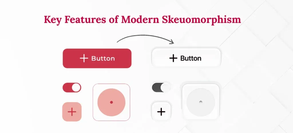
The modern skeuomorphic design has distinct characteristics:
Minimalist Realism
The references to the real world are simplified. Also, they don’t have excessive detail and only contain recognisable clues.
Soft Depth
Depth is acknowledged through drop shadows and highlights to create awareness without clutter.
Purposeful Texture
Texture is muted and functional, not decorative for decoration’s sake.
High Accessibility
Modern skeuomorphic design brings back depth and cues. Brands can support users with different rates of digital literacy.
Consistent Visual Language
All the elements or design elements transition to modern flat or semi-flat styles. In such a way that maintains a contemporary character for the brand.
Best Practices for Using Skeuomorphic Design Today
When applying skeuomorphism to your digital design, contemplate the following tenets:
Prioritize Usability
Use visual representations of the real world. When they provide understanding, visual navigation, or use.
Be Subtle
Visually detailed realism can be overwhelming—apply very restrained textures and shading.
Test with Users
You need to know if the skeuomorphic cues are helping clarity or creating confusion.
Blend with Flat Principles
Combine the simplicity of flat design with actual affordances and functionality using skeuomorphism.
Adapt to Your Audience
If your users are still learning the digital world, it may help to use looser skeuomorphic cues.
How to Implement Modern Skeuomorphism
I invite you to consider one way to thoughtfully build in some ‘real world’ feels into a digital design:
Identify Where Realism Helps
Think about some of the user interface elements that are improved. When there is depth or even physical cues, such as toggles, buttons, and input fields.
Simplify the Physical Reference
You’re not trying to recreate the entire physical representation. Just the most identifiable and functional elements.
Use Layered Shadows and Highlights
Use soft gradients or have drop shadows. To avoid extreme differences like opaque to clear, stay gentle with depth cues.
Integrate Consistently
You need to make sure that any skeuomorphic elements match or “integrate”. With your branding and visual identity and with all the other UI elements.
Optimize for Performance
If depth is in reach and you’re using CSS and vector graphics. There is no reason to pause or halt movement or depth-articulated qualities.
Iterate Based on Feedback
Make some changes via user feedback (usability studies). Also, analytics and see if the iterations help.
Conclusion
In retrospect, skeuomorphic design was a full-circle process. It was the only UI, then multilinear to flat. Now it has come back as a sophisticated, usability-first approach.
The modern version of neoskeuomorphism is all about compromise. Giving digital experiences some warmth and clarity by referencing the physical world. While respecting the elegance of today’s digital design options.
The dismissal of skeuomorphism shows one thing in this industry. Change is constant, but one thing will never change—users must come first.
Today, by thoughtfully applying skeuomorphic design. We can design digital interfaces that are more intuitive, stronger, familiar, and oh-so-human.
Want to master user-focused design and marketing? Join Digital CourseAI for a UI/UX design course in Gurgaon. Learn how to blend timeless design principles with modern tools to create engaging, user-first experiences.